
“Waterdance” ©Ruth Armitage 2014 Watercolor and Gouache on Paper 15″x22″
When an artist takes on the job of painting something that has been portrayed over and over in a trite or hackneyed way, it is imperative that the painting qualify as an original voice. This painting presented a challenge because of its subject matter. My aim was to portray a memory of our mother taking my siblings and I fishing in a small pond near our home, including the perpetual company of the resident dragonflies, without resorting to cliche. I hope that it has a feeling of joy and activity, and a presence that is unique.
One choice I made to avoid portraying the typical dragonfly painting was to choose a warm palette to depict the water. Picturing some of the artwork I’ve seen with dragonflies, they are often done with the greens and blues and violets of iridescence. My memory of Pete’s Pond does not include those colors. It is a small little swale, inhabited by sunfish and bass, but murky!
I wanted to suggest the refractions of water and the glistening wings of the bugs, without painting in detail or typical shapes and colors. Choosing Burnt orange and brilliant red-orange, along with creamier peaches and subdued rose shades for the majority of the painting gives that joyful feeling I am after. The brilliant turquoise accents lead the eye on a darting path through the painting.
I also tried to think in terms of pattern and shape. I attempted to include several suggestions of the insect throughout the painting. I also included calligraphy using paint and also Stabilo Pencil, which has a nice, loose feeling when moistened with a spray bottle. You can probably see that I was thinking of the prism-like segments on the dragonfly’s wings as I worked other shapes throughout the painting.
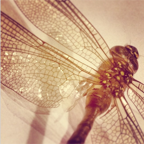
A dragonfly from last summer, it came to rest on the sidewalk in front of our house. I keep it in my studio as a reminder of delicate, intricate, everyday beauty.
When I search the internet for dragonfly images, the first image that caught my eye is the image below by Joan Miro. I doubt that anyone would describe it as trite or cliche. His surreal interpretation is immediately recognizable as a Miro.
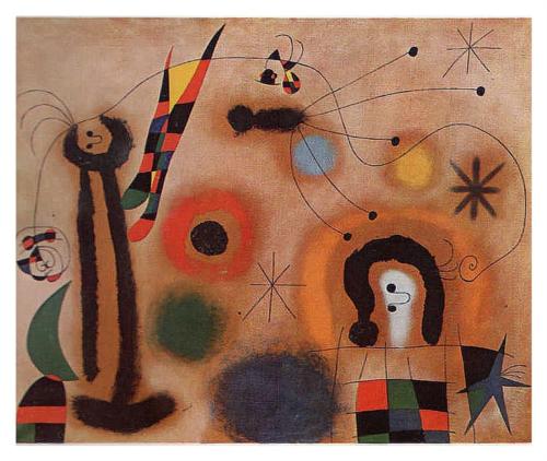
“Dragonfly With Red-Tipped Wing In Pursuit of a Serpent Spiraling Toward a Comet” © Joan Miro This artwork may be protected by copyright. It is posted on the site in accordance with fair use principles
I am looking forward to the upcoming exhibit of Miro’s work at the Seattle Art Museum, February 13 – May 25, 2014. I had the opportunity to see a large display of original works in Washington, D.C. on a recent trip, and the accompanying film about his life and art was terrific. I am particularly interested in Miro’s use of line.
If you’ve tried to paint a subject that has been painted often, what choices did you make to distinguish your work from the crowd? I enjoy reading your comments, and the enhanced discussion here is what makes ArtIsTruth such a great place to hang out. Share your thoughts!
Hi Ruth, I like how your dragonfly shape emerges from ground; the colors are lush! I do like Miro’s work. He was an original, creative mind. It must have been wonderful seeing his originals.
Lets see, how do I make my work my own. I think I spend time looking directly at the paper rather than the subject. My mind and eyes work together and I think about pattern and shape. I look at positive shape, negative shape. I think about weaving together all the corners. And, then I “punt”…that is my mind just goes for it.
Thanks Peggy! I love the ‘punting’ image. Making decisions and just going for it!
This is a beautiful piece, Ruth. So appreciate the interpretation.
Thank you Roxanne!
Thank you Ruth, good words. Digging within to honor my voice, produces my best work. It’s the same in life.
Love your piece, the colours and varying rock like shapes make me want to look closer….lovely.
Thank you Sheri! I’m off to visit your site…
No danger of Cliché here, Ruth. Love the color rebellion…no blues. My pond doesn’t look sweet either. We actually have vivid red dragonflies in Texas, so this is perfectly comfortable for my eyes! Love that you share your thoughts…Laura
Thank you Laura! Our dragonflies are usually blue & green. I’d love to see a fiery red one 🙂
Hi Ruth- I love this painting- love the colors and the unexpected. Nice work!
Thanks Lealie!