A fresh start for the new year should include some clean, fresh color in the palette, and that got me thinking… I don’t think I’ve ever posted about my choice of colors or my actual palette before.
I’ve migrated between several different watercolor palettes, including the Robert Wood palette that my first instructor started me on. One thing I really loved about the Robert Wood was the 24 wells for color. That seems to be a nice number of pigments to work with, though being a color addict, I could use more! I’ve tried the Stephen Quiller Palette (more color choices but hard to clean) and the Piggy Back Palette from Cheap Joe’s (harder to access the colors). I’ve even made my own palette out of plexiglass, cementing the wells together from tabs of plexi cut to size, but it was eventually damaged when I was shipping it to a workshop.
Now I’m using the Skip Lawrence palette, sold through Cheap Joe’s Art Stuff, augmented with the addition of a porcelain flower type palette. What I love about the Skip Lawrence Palette is the ease of cleaning it. One (or two) swipes down the center and you’re done! I wish it had more wells – hence the addition of the porcelain petal dish. But ease of cleaning and access to the colors are the reasons I stick with this palette. It also fits my French Easel and seems pretty resilient to travel. If they ever come up with an expanded version though, I’m all over it!
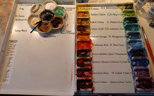
That said, my pigment choices have settled somewhat over the years. I’m always interested in trying new things, but I seem to consistently use my handful of basic standbys most often. Here is how I have them laid out.
I’ve used abbreviations to indicate my preferred manufacturers when applicable. C.J.’s stands for Cheap Joe’s American Journey, H. stands for Holbein, D.S. for Daniel Smith, G. for M. Graham, W.N. stands for Winsor & Newton. I notice that I need to buy more Brown Madder Quinacridone. I find DaVinci’s is almost as good as Winsor & Newton for this pigment, and I go through a lot of it! I’m also low on Andrew’s Turquoise from Cheap Joe’s. Maybe it’s time to place an order! The pigments in my porcelain flower palette tend to be more opaque, or things I’m just trying out or use less frequently. It’s easier to switch something out of the little palette than the bigger one.
I would say the dozen pigments I can’t live without are Holbein’s Indian Yellow, Daniel Smith Quinacridone Gold, Cadmium Orange, Cadmium Red, Brown Madder Quinacridone, Cheap Joe’s Skip’s Green, Holbein Blue Grey (or Cheap Joe’s Sky Blue), Ultramarine Blue, Holbein’s Cobalt Violet Light, Quinacridone Violet, Pthalo Green and Winsor & Newton Permanent White Designer’s Gouache. Of course there are quite a few that I use that I don’t keep on my palette all the time, but this is my regular set-up.
Recently I took a mini-workshop with Portland artist William Park in acrylic. That has influenced me to limit my acrylic palette to a very few colors. He uses just Pthalo blue, Quinacridone Red, Cadmium Yellow and Black & White. I have added Quiacridone Violet and Quinacridone Gold, two of my favorite pigments from the watercolor palette that I just couldn’t live without. In general the quinacridone-based colors are very vivid and transparent. They make beautiful mixes and glazes.
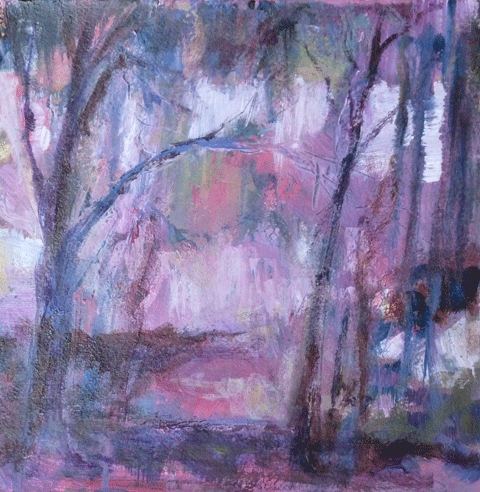
Here are some recent paintings done with the limited acrylic palette. It is amazing the range of colors one can mix with just a few pigments on the palette. I’m curious, which of these paintings do you prefer? It seems I get a different answer from each of my family members. Leave me a comment; I love hearing from you! And Happy New Year!




I like Winter Forest the best, but all are wonderful. Shall I just bring a check to the workshop or do you want me to send it now? I am excited.
I love the contrast of the blues, yellow and light and dark purples/lavenders in “Winter Forest”. I also prefer the composition of the tree on the left angling in and leading the eye into the painting:) All of them have your usual skill and charm, Ruth.
My favorite is “Winter Forest”. I think it’s the path leading in that does it for me. Also, enjoyed your article about your palette. Happy New Year, Jennie O’Connor
Hi Ruth, I found your article interesting and timely. I’ve been thinking that my pallets aren’t working for my purpose and thought I might try a different one. I enjoyed your acrylic pieces. Limiting the pallet seems to work!
I’ve looked at your paintings several times in the past week trying to pick a favorite. I’ve concluded that I like them all as each one has strengths that set it apart. Winter Forest is appealing as it seems warm and harmonious. It also looks more finished than the others. Perhaps you painted it first and then did the others more quickly to try different palettes.
Winter Warmth is striking for the contrast between the white and the pink/red. To me, the white adds a cold, icy element which makes me puzzle at the title. While there are warm colors in this one, they are offset by the white.
What I like about Forest Sentinels is the dominance of two colors, blue and yellow. The yellow brings a warm light to the cool blue trees. Having written about the three paintings, I guess I now prefer Forest Sentinels. But if I look more, my preference may change!
Thanks Hal,
Interesting analysis of the three paintings 🙂 I had a hard time with the title for ‘Winter Warmth’ too. It does feel cold. In the end, I decided to call it that because it helps me remember that this is the one with warmer colors, lol! I did paint Winter Forest first, but the others took me just as long. I was after a ‘less finished’ appearance and I guess I got it 🙂
I like Winter Warmth the best 🙂
I was wondering, would full watercolor pans fit inside your palette? I’m thinking of buying one, but I use pan paints.
Thanks for your comment Hania.
I do think that full watercolor pans would fit inside the Skip Lawrence palette.
Thank you so much for the reply!!