I promised a new painting in the “Down on the Farm” series by late last week, but it has taken me longer than expected to finish this abstract painting! The problem with painting images that are not supposed to be realistic interpretations of a landscape, figure or object is determining when to quit! One must rely on one’s own sense of balance, color, line, composition, etc. I decided to spend some extra time refining this painting because it didn’t feel resolved or organized enough to me. I’m still not quite sure I’ve got it nailed, but it is better. The next painting in the series is undergoing the final test of ‘living with it’ for the next few days. If I can keep from painting on it, I will post it soon. I thought starting this next one would keep me from messing with “Fire Line”, but I kept seeing things that I thought might help.
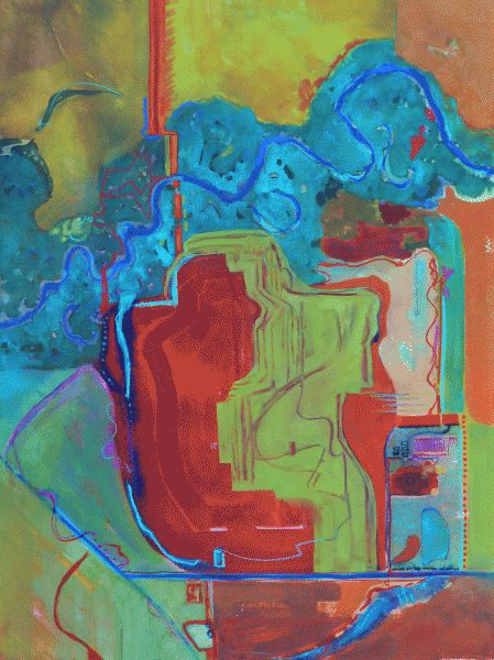
- Fire Line before modifications…
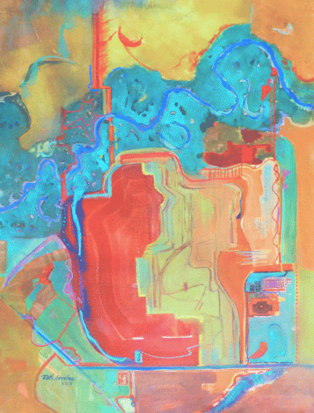
- SOLD “Fire Line” ©Ruth Armitage, Watercolor on Arches 30″x22″
You may be able to tell, I added more red lines linking the warmer shapes, added a warmer glaze over the bottom left corner, a cooler glaze over the upper left corner, and a warmer glaze over the right part of the middle green shape. Feel free to let me know what you think. Did my modifications help? Leave a comment if you can…
I’ve been spending time preparing for my class at Keizer Art Association next month. It’s going to be a wonderful time! Hope you can join us! This week I was asked to speak to a Chapter of PEO. I enjoyed sharing my art, and some of the inspiration I get via the internet. I also ordered frames for my paintings for the Sitka Invitational. I’m excited to be participating 🙂

I forgot to say, you can enlarge the image by clicking on it….
Hi Ruth,
I really like this exciting new series. It’s colorful and unique, and a great way to relive and capture life memories. It’s also inspirational such that I’ve sketched my boyhood home and thought about how I might portray other places I’ve lived. I see how this is challenging as one you must decide what to include and what to exclude with regards to detail, what symbols and colors to use and how to tie it together for good design. Plus there’s the challenge of avoiding it looking like a map.
With “Fireline” I think you are almost there, but you may have gone a bit too far with the red lines as it is verging on the “map” look. But that’s just my opinion from viewing the digital image. I expect it looks very different in-person, full size. I’m certain you’ll make the right calls.
I look forward to seeing the fine version of this one and to the next one in this series.
Thanks Hal. Yes, I worried that it would look too map-like… but I also felt like the reds needed connection. Ah the difficulties 🙂
I love this series, Ruth. Interesting, powerful, and full of content!
Thanks Susan and Hal!