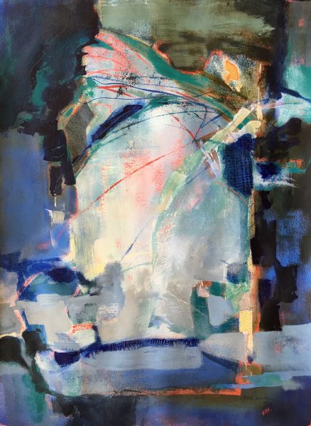
Here is “Golden Shore” a new abstracted landscape. I enjoy sharing new artwork here, knowing that my readers will provide feedback. This painting took a long time to mature. It began as a classroom demonstration, and sat unfinished for weeks. This past week I needed to get back into painting. Rather than start fresh, I decided to experiment with this one.

Golden Shore ©Ruth Armitage, 2016 15×11″ Acrylic on Paper
I had not been happy with the color on the original painting. It leaned toward the sallow gold you see near the bottom. I decided to try glazing over it with layers of more pure yellow, and yellow mixed with Golden High Flow Acrylic in white. The lines in the grey blue area are made using the same high flow acrylic.
I wanted to preserve the feeling of a golden landscape yet not become too realistic. As I painted, I tried to recall a song my grandmother used to sing. I couldn’t come up with the tune, but I hope I got the feeling. I hope the painting feels warm, almost fantastical.
“Creativity is like the ocean: sometimes it is an unstoppable wave bursting forth, crashing onto the shore, and overwhelmingly flowing with no hope of restraint; other times it is completely still, lingering aimlessly and endlessly, seemingly devoid of any inspiration.”
-Ken Poirot
Good news!
My mentor, Katherine Chang Liu has juried my painting “Two Sides” into the Rocky Mountain National Watermedia exhibition. It is an honor, and I’m looking forward to seeing the other 79 works that were selected from a pool of over 500 entries. The show runs from September 16 through October 23, 2016 at the Foothills Art Center, in Golden, Colorado.

“Two Sides” ©Ruth Armitage 2016, Acrylic on Paper 30×22″
Question for my readers: do you enjoy an abstracted artwork more if you know what inspired it, or what it refers to? Leave me a comment!


I especially like the ripples in the water. I like the theme very much
For me there is too much yellow although it makes the sunshine sizzle
Yes for abstract art it is very important to me what inspired it or what it refers to.
Thanks Chris. I can imagine that if yellow was not your favorite color this painting might be a turnoff 🙂
Hi Ruth,
The image is always what attracts me before I read what the artist says. Color and design are strong areas which attract me no matter – abstract, non-representational or any other the schools of more realistic art.
The golden light in this one glowed from my monitor next to the priceless bits of cool area. I like it so much. Only then I could allow myself to read how it came into being. My art/greedy need to know was satisfied and I find that I liked the painting even more.
Congratulations on two Sides being chosen. I enjoyed many a show at the Foothills until leaving Denver.
Thank you Julie, for taking the time to comment, and for your words of affirmation!