Work in Progress – Ruth Armitage
This week in my Wednesday Watercolor class we continued our focus on color. I shared some of my creative process with the class and with my newsletter subscribers. I have a bit more time to write now, so I will expound a bit more.
As is often the case, I chose colors for my painting that were similar to what I was wearing. It is uncanny to me how intuitive our color choices often are. One day we might feel like wearing more neutral colors, other days a vivid shade appeals to us. Some people are only comfortable wearing one type of color. I have a friend who wears ONLY subdued neutrals… black, grey, taupe, khaki.
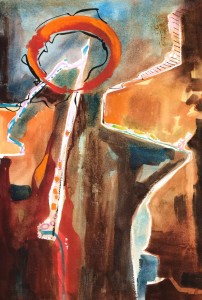
I began this demonstration painting by sketching some rough shapes in water soluble pencil. When painting abstractly, the shapes I choose are often representative of my subject. You’ll notice that the two light warm shapes on left and right are separated by a rather jagged white line. I thought of these two areas as representing two different points of view.
I worked using a desert triad for the first layers of color. I used Brown Madder Quin. (close to indian red) Manganese Blue (close to cerulean) and Raw Sienna (close to yellow ochre.) These subdued colors felt right to me, but I also wanted some strong contrast.
I painted around the white linear shapes. Then toward the end of the demo I added the cadmium oranges and reds, and pure black calligraphy.
The class was challenged s to use a color triad in their work, making sure to have a dominance of either warm or cool color.
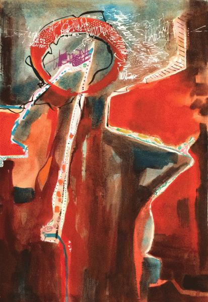
When I got home, I worked on getting a bit more variation in the colors in the painting. I glazed over the oranges with French Vermillion (Sennelier) to strengthen them. I also added more line work in the upper part of the painting using Golden’s High Flow Acrylic in white. I put it in a squeeze bottle with a fine point and it worked wonderfully for calligraphic line.
I still don’t really like the violet shape near the point, and I’m thinking of removing it, or covering it. I guess I should have been more faithful to the desert triad! I think the violet area would look much better with a bright turquoise. The painting below is how I’ve left it for now.

“Argument” ©Ruth Armitage, 2014, 21×14″ Mixed Media $750


Thank you for the abstract lesson! As you know, my journey into non-objective is bumpy.
I was just thinking how much I liked the magenta/violet.
Hi Ruth- thanks for posting a recap of the class I missed last week – I really like your process of interpreting events, feelings and words with paint. I also struggled this week with adding an element to a piece in process that I later wished I hadn’t . I will be interested to see if and how you adjust the violet shape. I’m wondering what the circle represents? The argument itself or the resolution? Unfortunately I’m at the hospital today with a relative and will have to miss class again. 🙁 I will try to paint along this week with your posted class notes – maybe I should paint “frustration” with not being able to paint as much as I would like …… Thanks again for inspiring me!
I think it is a very thought-provoking painting, with or without the violet. I am personally in love with turquoise so would gravitate to that. But beyond that, I am really enjoying how much you explained your process. It’s a very good post!
Thanks Donna, Jean, Tara & Margaret 🙂 I appreciate hearing from you & glad you enjoyed the post!