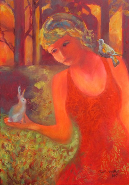
This morning as I considered images to include with this post, I noticed that all of my recent images had one thing in common: a dominance of Red! If I look around my home there are accents of red spicing up the decor in key areas. It is a strong color that can stimulate emotions and draw the eye. It’s no coincidence that Red is used for stop signs, marketing and lipstick.
In nature red acts as a beacon for wildlife, attracting birds and insects as pollinators. People react to it in much the same way. In some cultures red can be a symbol of purity, joy, romance, celebration or luck. Conversely, it can also symbolize anger, evil pain, or anger.
The spectrum of meanings associated with red make it a particularly provocative color to use in artwork. Red can symbolize different meanings for each individual. I read an article about figurative painter Anne Harris this morning and her theory about explaining her work was that “Her job as an artist was to give birth to the image, not to tell us what it means.” As a viewer, would you rather interpret an artwork on your own, or have a discussion with the artist?
My feeling is that the successful artwork can have many meanings and that as long as the viewer is moved or interested, the work is successful. Or, in the words of Marcel Duchamp:
‘The creative act is not formed by the artist alone; the spectator brings the work in contact with the external world by deciphering and interpreting its inner qualifications and thus adds his contribution to the creative act…”
SOLD
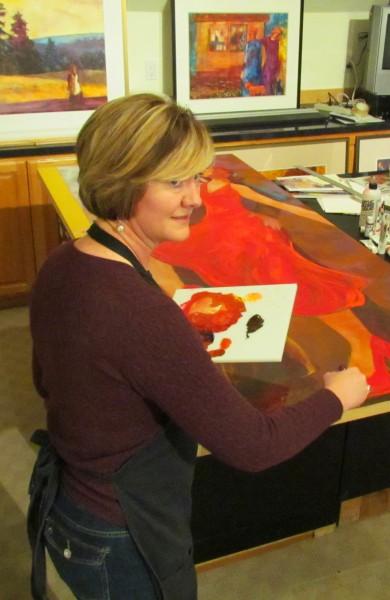
I thought I’d leave you with an image of my current work in progress. The title is “Move Me” and the finished painting will be 36″x80″. I love working on this scale because it allows me so much area to play with color. My marks take on a more gestural quality. Sometimes other artists (particularly watercolor painters) tell me that they have a difficult time working in a large format. My belief is that you can if you think you can.
You can view the completed painting next month at the opening of “The Door Show #5” curated by Mary Lou Zeek. The show runs Tuesday May 3 – Saturday May 28 at various locations throughout downtown Salem. Walking tour maps are available at the gallery: 335 State Street, Salem Oregon. Join me for the artists reception, Wednesday May 4 from 5-7 pm.
“How often in life we complete a task that was beyond the capability of the person we were when we started it…” – Robert Brault
Let me know what you think of the new paintings: click the ‘more’ button to leave a comment. And don’t forget to sign up for my Spring Fling Shapes Weekend! More details on the Workshops Page.


Ruth ~ Your paintings are always so colorful and vibrant! Do you use traditional watercolor paints? I see your palette is not so ‘traditional’. I struggle with getting such color in my paintings. You do a super job of it!
Thank you Lisa! Yes, I do use traditional watercolors with the addition of white gouache in some of my work. I often use a non-traditional brush, however, which allows me to use a more concentrated pigment with less water. Glad you enjoy the paintings!
PS, the palette you see in my work in progress is for acrylic. My door painting is on a door panel, so I’m using acrylic in that photo. For the palette I am using a thick piece of plexiglass to mix on.
Thanks for your quick reply, Ruth. Ah…now that makes sense. What kind of brush do you use? I also enjoyed your post on how you plan out a painting from a photo. Was wondering how you got the yellow accent on your subjects’ glasses. I thought it might be qouache, but wasn’t sure. All your colors, as I said, are so vibrant. Guess I just need more practice!
Hi Lisa,
I use a wide variety of brushes, but my favorites are called ‘Skippers’ made by Cheap Joe’s Art Stuff. They are made of a quality hog bristle and I love the effects you can get with them. The yellow highlight I’m pretty sure was just cadmium lemon applied fairly thickly. I may have added a tiny bit of gouache, but I don’t think so. Not that it matters, LOL! There is gouache over 90% of that painting 🙂
Thanks for the tip, Ruth. I’ll check them out. As I said, all your watercolors look more like acrylics…and I like that effect a lot. Watercolor is fairly new to me, so am struggling to get the kind of looks I want. I’m tempted to go acrylic, but really want to see if I can get similar effects w/watercolors before giving up entirely…lol! As I said, practice…practice…practice! Have a great day!
Ya gotta love the reds Nice work.
I wish more art, literature and music professors were familiar with the Duchamp quote. I might have made better grades in college. LOVE the reds!
How do I get my picture in my square? LOL
Thanks Liz 🙂 Hi Lisa…. to get your picture to show up in your square you need to sign up with Gravatar. http://en.gravatar.com/ It’s free and it works on many sites. (At least I think that is how I did it!)
Dear Ruth,
Once again you illuminate and educate with your words.
This is one of your many gifts that you share so generously.
Thank you for the intellectual, as well as the artistic, journey with “Red”.
Linda
Aww, Thank you Linda! I love thinking about the effects of color, so it was fun to share. It was kind of surprising to me to find myself on such a red streak!
Thanks, Ruth…let’s see if it worked!
easy peasy, huh?
Oh, I see a yellow Van Gogh sky in the “Marshlands” painting! How exciting!
Beautiful expressive paintings as always…
Thank you Blenda 🙂
For the second year I’m intrigued by the idea of painting a door. Quite a challenge I imagine.
I love red, too. Nice stuff you have there!
Thanks Margaret… It has been a challenge, but pretty fun too 🙂