Two sides of the coin, two sides of the canyon, two sides of the story – what does this title refer to? I’d prefer not to answer. Maybe it refers to all of the above and more… two sides to my personality, two sides of my artistic temperament.
I had a difficult time coming to a conclusion for this work, and at the end, I decided to let it rest here, for now. Perhaps one of my hang-ups was trying to make it great… instead of focusing on just trying to express something, of just moving on to the next work. Here are some of the transformations it went through:
- Beginning with a vividly vermillion watercolor wash over the entire paper, I added cooler color in acrylic and gesso over the top. The painting began as a class challenge for my weekly class at OSA – to begin with mostly warm, and end with mostly cool dominance.

in progress
2. Adding color changes and complexity to both dark and light areas, emphasizing and repeating lines, de-emphasizing the two appendage-like shapes on the right.
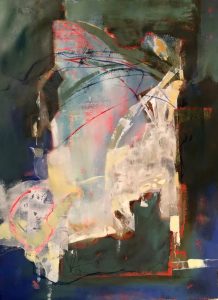
in progress #2
3. adding veils of light and more shapes to bottom using masks and Liquitex acrylic spray paint. Subduing some of the light areas near the top.
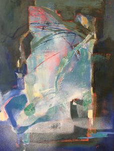
in progress #3
4. I feel like the whole painting involved pushing between more strong and more subtle contrasts… here I tried intensifying the color changes within the darks along the right and left sides.
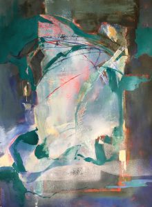
in progress #4
5. final (I think!?) image – I added a few more brilliant vermillion lines and details. Also a bit more calligraphy within some of the dark shapes… also a few more neutral grays near the bottom of the image, and a bit stronger shapes on the two sides of the large light area in the center.
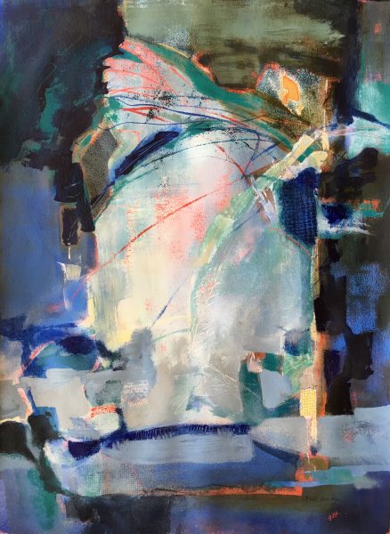
“Two Sides” ©Ruth Armitage 2016, Acrylic on Paper 30×22″
Let me know what you think. My goal was to use a fairly symmetrical composition, yet keep it a bit off balance. I wanted to stress the connection and the difference between the two sides of the image.
Are there versions of the painting that you like best? Do any of you keep record of the transformation of a painting? Leave me a comment!

I fell in love at the second image, but I understand why you continued with your goal in mind. The final piece is wonderful.
I do take images of my work in progress; helps me to not overwork (sometimes lol).
Thanks Bobbie!
Is this on canvas? What is the size? It is beautiful. Every stage is so different.
Thank you Laura! It is on watercolor paper. The image size is 30″x22″. The framed size is 38″x30″.
I love this piece RuthAnn!!
I really like the complexity of all the different layers and patterns.
Thank you Michele! 🙂
Ruth– like it– think I will try it making both sides dramatically different.
Thanks Judy! I’d be interested to see your results 🙂
I love the cobalt blue you added to the final version. It lets your eye bounce around like a bubbling brook. And the dark green and scratched in diagonals that happened earlier.
Thanks Rene!