Color notes have been so important as I prepare work for my June show “Tribute” at Waterstonte Gallery. Usually I begin my paintings with a title, which guides my decisions as the work progresses.
Now, the ‘Tribute’ show is different, in that each painting will be an abstract representation of artists who have influenced my creative journey as teachers. Early in the process I decided to keep the format and composition of each work similar to provide continuity.
Because it worked for the first image, I then decided to fit a color scheme to each artist. I tried to consider my personal relationship with the artist, rather than thinking about the types of color the artist uses in their own work. Making color notes and mixing colors on the painting helped me clarify the direction for these works.
Color Notes Examples
For example, here is a detail of a piece about one of my major mentors, Katherine Chang Liu. The painting began with the warm rose colors. As I thought about my relationship with Katherine as a mentor, I settled on how she nurtures each student in an almost maternal way. Shapes were the next thing that I chose. The bowl is a symbol of being fed by the inspiration of Katherine’s workshops.
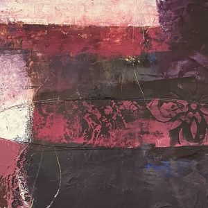
Rose Color Notes on Work in Progress, detail
I’m sure other artists who have worked with Katherine would choose different colors – choosing color is such a personal and intuitive act. How many times have you chosen a color for an art piece and realized that you were wearing something of a very similar shade?
You can read more color notes about my specific palette here: https://rutharmitage.com/all-about-my-palette/
What color would you say best represents you? What color is your favorite? Join the conversation by leaving a comment. I’m looking forward to seeing the exhibit and the work that each of my mentors will be sending!
Synesthesia & Color
Now it’s your turn. Do you keep color notes? Are you aware of associations between people and color? We can become more aware of how we make color choices by keeping notes, reading or writing poetry and analysing paintings we’ve done.
Enjoy the poem below, and please mark your calendar for June 2, 2022 – I’d love to see you at my opening reception at Waterstone Gallery!
A Diary of Colors
My second grade teacher liked to ask us,
“How do you feel today, on a scale of one to ten?”
Ten always meant I’m super, thank you
and one was always not today, Mrs. MacAuley, not today.
But I never liked numbers, they would always
twist and rebel against my mind so I chose
to speak in colors instead.
January third – I am the color
of mint chocolate chip ice cream
but I’ve eaten all the chocolate chips.
I am calm.
February seventh – I am a bruise of
blues and violets today. I think it would
be best if I sat by the window.
These are unhappy colors.
April eleventh – I am turquoise, I am magenta,
I am every color in the rainbow.
April thirtieth – I am gray, I am silent.
May first – I am orange, the color of melting
creamsicles on a beach in July.
June twelfth – I am as yellow as the school bus
that will bring me home to summer. I am free.
Twelve years later, I still use colors.
The winter makes me feel cobalt blue, the ocean
turns me a seafoam green. Violets and purples
leave me uneasy and scarlet is a fever of fury.
Some nights I drown in shades of navy, denim,
and cornflower but other nights I meditate in forests of
harlequin and shamrock.
But you,
you leave me a blinding white followed by a soft yellow:
the color of sunlight after a period of darkness.

I am still lamenting about unable to go with Linda Hornbeck to Italy with you in October. However I will be visiting her in Dallas, and spending some time in Portland. Can I see any of your work up while there between May 17-27. I believe you won’t be quite ready at the Waterstone Gallery at that point. Nevertheless, I wish you the best with your new opening.
Hi Loretta, I know – I’m sad! I’ll have work hanging at Waterstone Gallery and at Portland Art Museum’s Rental Sales gallery in May – it just won’t be my full solo show at Waterstone. Enjoy your visit!