
Paring down your painting materials for plein air painting or travel can be a challenge. I’ve been testing color combinations, narrowing my choices for which colors, paper and sketchbook I’ll bring with me on my trip to France. I hope this post gives you some ideas of what options I’m considering and why.
#Colors of France
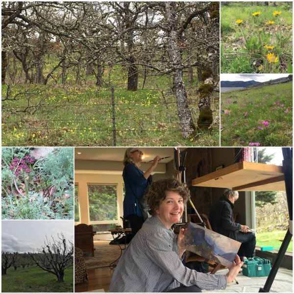
Since my workshop in France will focus on color, my palette is my primary consideration. The travel set I have allows for 24 half pans, plus a couple of full pans. I’m trying these colors out early, so that I won’t have any surprises once I’m in Europe. The following recommendations are my own opinions, of course! I’ve selected them thinking about painting the landscapes of France. I just tested them while painting on location in the Columbia River Gorge and they worked quite well!
I’m always fascinated by other artist’s choices, so I hope you’ll indulge me in outlining my suggestions. Maybe you’ll find a few new colors to explore. And your reward for reading all the way to the end will be an opportunity to enter the giveaway!
I’ve broken my Plein Air color choices into groups:
- 8 essential colors
- Additional colors to equal 12
- Splurge additions to equal 16
- Last priority colors, ranked according to priority
8 Essential Watercolor Pigments:
First off, my eight essential colors should give me quite a bit of flexibility for mixing plein air. I have selected warm and cool primaries with the addition of black and white. I’ve noted the characteristics that helped me choose these pigments and my preferred manufacturer.
- Cadmium Yellow Pale (Holbein) a very cool yellow which is also opaque. This is helpful when we change our mind, midstream.
- Indian Yellow (Sennelier) a beautiful warm yellow, transparent and strong enough for beautiful glazing effects.
- Cadmium Red Medium – a warm, opaque red
- Quinacridone Red (Daniel Smith) – a cool, transparent red
- Cobalt Blue – (Qor) a semi-transparent blue that leans toward red
- Phthalo Blue – (Winsor & Newton) a transparent, staining blue that leans toward green
- Blue Royal (Sennelier) – a very opaque blue, mixes great neutrals and gives excellent coverage
- Phthalo Green – a rich, transparent, staining green
Exciting Additions:
Next, If your palette has room for 12 colors, add the following:
- Naples Yellow – a nice subdued yellow which is very opaque
- Quinacridone Gold – a beautiful, transparent, golden hue that makes a beautiful glaze.
- Brown Madder Quinacridone – (Da Vinci) a transparent reddish brown that makes beautiful dark mixtures
- Designers White (Titanium) Gouache (Winsor & Newton) Nice and opaque, easy to re-wet
For the Color Addict:
Room for 16 colors in your palette? Add the next 4 pigments:
- French Ultramarine Blue – a granulating, cool blue which mixes wonderful neutrals
- Quinacridone Magenta (Daniel Smith) – a nice transparent, reddish violet
- Rich Green Gold (Daniel Smith) – transparent, yellowish green with lots of power
- Black – Great for a true neutral, or as a mixer to subdue color. I am mourning the loss of Reddish Black in the American Journey line of watercolors, and looking for a good replacement.
Color Immersion:
After that, if you have room for 20 or more colors, here are the other hues I’ve added to my palette, in order of my priorities.
- Alizarin Crimson Permanent (Daniel Smith) – a great dark, cool red. Excellent for mixing neutrals and rich passages
- Cobalt Teal (Daniel Smith) – an opaque, greenish blue – I think of this color as very modern when used as a pure hue, but it also mixes beautiful grays
- Manganese Blue – another blue that leans toward green, this one provides magnificent granulating texture and beautiful mixes
- Burnt Sienna – another granulating color, a beautiful earth tone. Many consider this part of their basic palette
- Cobalt Violet Light (Holbein) – a beautiful reddish violet that provides excellent granulation and beautiful mixes. Although it is quite expensive, I wouldn’t want to do without it
- Shadow (American Journey)- a deep, rich blue-violet, slightly neutral and transparent
- Moonglow (Daniel Smith) – similar to Shadow, but granulates beautifully, with a bit of color separation between the blue and the reddish tones
- Cadmium Orange – a nice opaque orange
- Skip’s Green (American Journey – a beautiful, springy yellow green
- Cerulean Blue (Winsor & Newton) – similar in sediment and hue to Manganese, but much more opaque
Placing the Colors in Your Palette
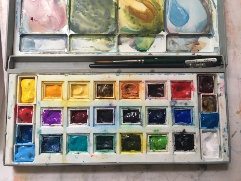
Finally, I’m listing the pigments in the order of appearance in my palette. I like to organize the colors by temperature in each color family as a spectrum. From left to right on my palette:
Top Row: Cad. Yellow Pale, Indian Yellow, Naples Yellow, Quinacridone Gold, Cadmium Orange, Brown Madder Quinacridone, Cadmium Red, Alizarin Crimson, Burnt Sienna
Middle Row: Quinacridone Red, Cobalt Violet Light, Quinacridone Magenta, Moonglow, Shadow, French Ultramarine Blue, Cobalt Blue, Cerulean Blue
Bottom Row: Manganese Blue, Blue Royal, Phthalo Blue, Cobalt Teal, Phthalo Green, Rich Green Gold Skip’s Green, Black, White Gouache
Choosing a Watercolor Block & Sketchbook
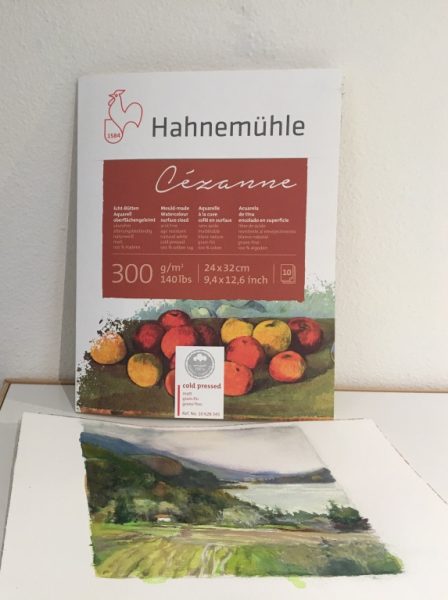
Thanks to the generosity of Hahnemühle, I’ve been sampling some watercolor blocks and sketchbooks. On my recent trip to the gorge I tried out the Cézanne Block in Cold Press. It is 140 lb. and has a classic texture to the paper. I’ve found that the sizing is just right, allowing me to lift and glaze colors freely. You can read my full review of this block here.
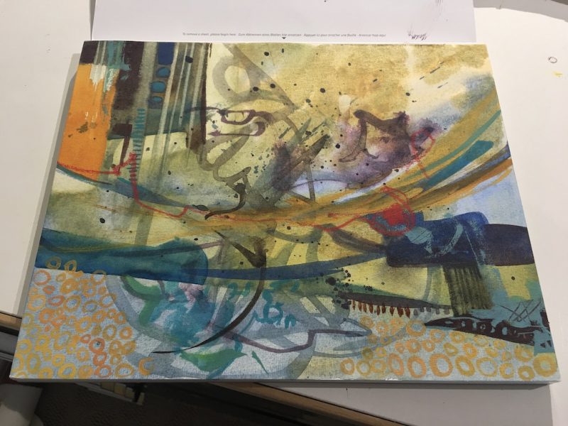
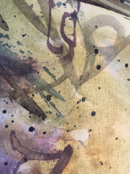
I also did a quick abstract sketch on the Expression block by Hahnemühle. This paper is also 140 lb, and lifting color is even easier with this surface. Glazing also works well. I did notice a slight woven appearance to the texture of the Expression block. See the detail image below. I’ll work on it further this spring before I decide which block to carry with me to France.
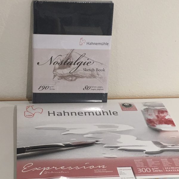
I’ve also sampled two journals: the Nostalgie Sketchbook and the Travel Journal. Choosing one of these books will be a difficult decision. I love the cover and elastic of the Travel Journal, along with the pocket in the back. See my full review of this book here.
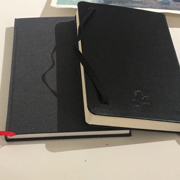
But, three things stand out in the Nostalgie Sketchbook that make me think I may choose it for my trip:
- The paper in Nostalgie is beautifully white. For a colorist, this is very important! In picking colors for my palette, I did a good bit of testing and mixing in this book, and the true white is a much better surface for color.
- Nostalgie is a slightly thinner book, which would save space for packing during travel
- The paper in Nostalgie was slightly better at laying flat after light washes of watercolor and the color did not show through the back of the page as much as the paper in the Travel Journal. (Neither book shows color through the page too much, but Nostalgie seems slightly better.)
If you’d like to order any of these products, I’ve listed below some of the places they are available in the US.
*Disclaimer: Hahnemühle provided me with samples of these products for testing prior to review and for gifting to my readers. The reviews are my own, unbiased opinions and I was not compensated in any other way for providing my opinion.
Enter Here to Win!
[RF_CONTEST contest='14358']The Cézanne Watercolor paper may be purchased online from the following dealers:
Art Materials ; https://www.artmaterialsonline.com/search/cezanne/0/1/1
Acuity Papers: https://www.acuitypapers.com/SearchResults.asp?Search=hahnemuhle&Submit=
Cheap Joes: https://www.cheapjoes.com/hahnemuhle-watercolor-blocks.html
DaVinci Artist Supply: https://davinciartistsupply.com/shop/advanced_search_result.php?keywords=hahnemuhle+cezanne&search_in_description=1&x=0&y=0
Hyatts: http://www.hyatts.com/search.php?q=hahnemuhle+cezanne&x=8&y=5
Rochester Art Supply: http://www.fineartstore.com/p-12268-hahnemuhle-cezanne-watercolor-blocks.aspx
Carries the product but not listed on their websites:
Arch Supplies: http://www.archsupplies.com/
Artisan Santa Fe: http://artisan-santafe.com/
California Art Supply: https://www.calartsupply.com/
Trekell & Co: https://www.trekell.com/search.asp?keyword=hahnemuhle
Univertsity Art: https://www.universityartcatalog.com/
Wet Paint: https://www.wetpaintart.com/catalogsearch/result/index/?p=3&q=hahnemuhle

Great post!
Thanks, Abigail!
Wonderful post!
Thanks, Carol 🙂
It was such fun watching you paint on the Hahnemühle block last week and now to read about how you decided on your colors. I’m sure they’ll serve you well in France. You’ve done a masterful job of planning this experience and I’m sure your students will get their money’s worth, and more. How I wish I could join you!
You’re so kind, Jo! I enjoyed our trip so much, and can’t wait for France. Wish you were going too!!! Maybe next time 🙂
Hi, Ruth, I was introduced to watercolor on a travel/class to Italy in 2012. What I wonderful way to learn to view an area. Even though I will not be on your trip, which I know will be incredible, I love, love, LOVE seeing what accomplished artists include in their travel art supplies. Thanks for sharing.
Thank you, Viginia! So good to know that you enjoyed my post! Maybe next time I take a painting trip, you can come along!